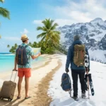
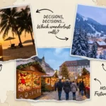
Making a travel brochure means combining strong visuals, clear destination information, and a compelling call to action into a single printed or digital piece. Here’s how to do it in 6 steps: (1) Choose your destination and audience, (2) Gather photos and key facts, (3) Pick a layout or template, (4) Write punchy, benefit driven copy, (5) Add contact and booking details, (6) Print or export for digital sharing.
There’s a moment every traveler knows you pick up a folded brochure at a visitor center, flip it open, and suddenly you need to go to that place. That’s the magic a well made travel brochure creates. But if you’ve ever tried to build one yourself for a school project, a small tourism business, a community event, or a personal travel blog you know it’s harder than it looks.
The challenge isn’t just design. It’s knowing what to include, how to write about a destination without sounding like a Wikipedia entry, and how to make the whole thing feel like an invitation rather than a pamphlet. If you’re promoting a national park road trip, a small town bed and breakfast, or an international adventure, a great travel brochure does one job well: it makes people want to go.
This guide walks through every step of creating a travel brochure from choosing the right format to writing a copy that connects emotionally with practical tips built for real travelers, tourism professionals, educators, and small business owners across the USA.
What Is a Travel Brochure and Why Does It Still Matter?
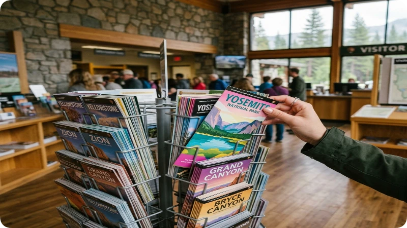
A travel brochure is a short, visually driven document printed or digital that highlights a destination, attraction, or travel experience to encourage visits or bookings. Despite the rise of social media and travel apps, brochures remain one of the most trusted forms of tourism marketing. According to the Tourism Industry Association of America, printed travel collateral still influences around 53% of visitor decisions at welcome centers and hotel lobbies.
Brochures work because they’re tangible, scannable, and designed for a single clear purpose. A good brochure answers three questions fast: Where is this? Why should I go? How do I get there? When those three questions are answered well, the reader becomes a visitor.
Who Should Make a Travel Brochure?
Travel brochures serve a wide range of creators and purposes:
- Tourism boards and DMOs promoting a city, region, or state
- Small business owners running hotels, tour companies, or rental properties
- Educators and students completing geography or marketing assignments
- Travel bloggers and content creators building a media kit or press package
- Event planners promoting travel themed events or destination weddings
- National and state park visitors centers (like those run through the National Park Service)
No matter your reason, the process is mostly the same. The format and tone shift depending on your audience but the fundamentals stay consistent.
Step 1 Choose Your Destination and Define Your Audience
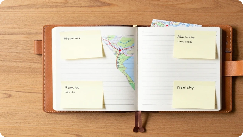
Before opening any design tool, get clear on two things: what you’re promoting and who you’re talking to. These two decisions shape every other choice you make.
Start by writing one sentence that captures the core appeal of your destination. For example: “Sedona, Arizona is a red rock wilderness town known for hiking, art galleries, and spiritual retreats, perfect for couples and solo adventurers seeking both beauty and calm.” That sentence becomes the invisible spine of your whole brochure.
Audience Profiling Questions to Ask First
- Is your audience families, solo travelers, seniors, or adventure seekers?
- Are they local day trippers or long distance travelers planning weeks ahead?
- What’s their likely budget range, mid range, or luxury?
- What do they care most about food, nature, history, nightlife, or wellness?
Knowing your audience helps you decide what photos to use, what tone to write in, and which details to highlight. A brochure targeting retirees visiting Savannah, Georgia will look and read very differently from one targeting college students doing a Southwest road trip.
Step 2 Gather High Quality Photos and Visual Assets

Photos do more heavy lifting in a travel brochure than any other element. A single stunning image of the Grand Canyon at golden hour communicates more than three paragraphs of description. Collect your visuals before you start designing, not after.
Where to source quality travel photos:
- Your own photography always the best option for authenticity
- State and city tourism board photo libraries many offer free use images (check tourism.usa.gov and state level tourism sites)
- National Park Service media resources NPS.gov provides downloadable photos for educational and non commercial use
- Licensed stock photo platforms Unsplash, Pexels (free), or Shutterstock (paid)
- Local CVBs (Convention and Visitors Bureaus) often provide destination photos upon request
Photo Tips for Travel Brochures
Aim for at least 4–6 photos in a standard tri fold brochure. You’ll want one hero image for the cover, 2–3 activity or attraction images for the inside panels, and 1–2 supporting lifestyle shots showing people enjoying the destination.
Insider tip: Avoid photos that look overly staged or tourist trap generic. A photo of a real local meal at a beloved diner in Memphis will land harder than a stock image of sushi that could be from anywhere.
Always check licensing rights before using any image. When in doubt, photograph it yourself or reach out to the local tourism board.
Step 3 Pick the Right Format and Layout
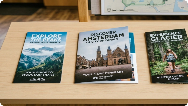
The format of your brochure determines how much information you can include and how readers interact with it. Choose your format based on purpose, distribution method, and budget.
Common Travel Brochure Formats
| Format | Best For | Panel Count | Typical Size |
| Tri fold | General tourism, visitor centers | 6 panels | 8.5″ x 11″ folded |
| Bi fold | Simple destination overviews | 4 panels | 8.5″ x 11″ folded |
| Z fold | Maps and step by step itineraries | 6 panels | 3.67″ x 8.5″ each |
| Rack card | Hotel lobbies, point of sale | Single card | 4″ x 9″ |
| Digital PDF | Email, website download, QR code link | Unlimited | Screen optimized |
The tri fold brochure is the most common format for travel use and is the standard size found in national park visitor centers, airport terminal kiosks, and hotel front desks. It gives you six panels to work with enough space for a cover, map, key attractions, practical info, and a back panel with contact details.
For digital first audiences, consider designing a horizontal PDF brochure optimized for screens. These work well for email campaigns, travel blog readers, and mobile sharing.
Step 4 Choose a Design Tool That Fits Your Skill Level
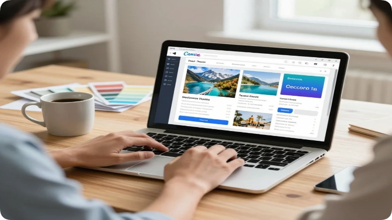
You don’t need to be a professional graphic designer to make a great travel brochure. The right tool makes the process manageable for beginners while still allowing pros to customize freely.
Best Tools for Making Travel Brochures
Canva (Free and Pro versions) Canva is the most beginner friendly option and probably the most popular for non designers. It offers dozens of travel brochure templates, drag and drop functionality, and built in photo libraries. The free version covers most needs; Canva Pro ($12.99/month as of early 2025 verify current pricing at canva.com) adds brand kits and premium templates.
Adobe InDesign The professional industry standard for print design. InDesign gives you precise control over typography, bleeds, and print ready file exports. It has a steeper learning curve but produces the highest quality results for professional use. Available through Adobe Creative Cloud check adobe.com for current pricing.
Microsoft Publisher A solid option for Windows users already in the Microsoft ecosystem. Publisher includes brochure templates and familiar formatting tools. It’s not as visually polished as Canva or InDesign, but it works well for school projects and simple small business use.
Google Slides or Docs Works in a pinch for digital only brochures. Not ideal for print, but useful for quick classroom projects or basic informational handouts.
Visme and Adobe Express Both offer travel brochure templates with user friendly interfaces good middle ground options between Canva and InDesign.
Insider Tip on Templates
Don’t start with a blank canvas. Start with a template, then replace every element colors, fonts, photos, text with your own. This approach saves hours and ensures your layout is structurally sound before you start customizing. Just make sure the final product doesn’t look like 50 other brochures made with the same template.
Step 5 Write Copy That Sells the Experience, Not Just the Place
This is where most travel brochures fall apart. The photos look great, the layout is clean and then the copy reads like a Wikipedia article. Strong brochure copy is short, specific, sensory, and emotionally driven.
The Golden Rules of Travel Brochure Copywriting
Lead with a feeling, not a fact. Instead of “Asheville, North Carolina is located in the Blue Ridge Mountains,” try “Nestled in the Blue Ridge Mountains, Asheville pulls you in with live music drifting from rooftop bars and the smell of fresh sourdough from its James Beard–recognized bakeries.”
Be specific. Vague claims like “stunning scenery” and “world class dining” mean nothing. Name the waterfall, the restaurant, the trail. Specificity builds credibility and desire.
Use active verbs. Hike, taste, discover, wander, paddle, explore. These words put the reader inside the experience instead of describing it from the outside.
Keep sentences short. Aim for 12–18 words per sentence. Brochures are scanned, not read. Short sentences survive scanning; long ones don’t.
Include a clear call to action. Every panel should tell the reader what to do next: “Visit our website,” “Book your stay,” “Call for a free visitor guide,” “Scan the QR code to plan your trip.
What to Include in Each Panel of a Tri Fold Brochure
Cover panel: Destination name, hero image, one tagline sentence Inside left: Top 3 attractions or experiences with brief descriptions Inside center: Map or key practical information (getting there, hours, costs) Inside right: Accommodation or dining highlights + testimonial or quote Back left: Contact info, website, social handles, QR code Back center: Mailing address or logo (if used as a mailer)
Step 6 Add Practical Travel Information Readers Actually Need
Beautiful photos and inspiring copy bring people in. Practical information is what converts interest into action. Don’t skip this step; it’s what separates a brochure from a pretty piece of paper.
Essential Practical Details to Include
- Location and how to get there: Nearest city, airport, highway exit, or public transit option
- Hours and seasons: When is the destination open? What’s the best time to visit?
- Cost range: Entry fees, average hotel prices, or tour costs (note that prices change always direct readers to verify)
- Contact information: Phone, email, website, and social media handles
- Accessibility notes: Is the destination wheelchair accessible? Are there family friendly facilities?
- QR code: Link to your website, booking page, or digital map
Insider tip: Add a QR code to every printed brochure. It bridges the gap between print and digital, lets you update destination info without reprinting, and makes it easy for visitors to book or share the brochure instantly.
For destinations on or near federal lands, link readers to the official NPS website (nps.gov) or state tourism board for the most current information on permits, closures, and fees.
Step 7 Design Tips That Make Your Brochure Stand Out
Great design isn’t about making things look pretty, it’s about making information easy to find and use. These principles apply if you’re using Canva or InDesign.
Color Palette
Choose 2–3 colors maximum. Use one dominant color (usually pulled from your hero photo), one accent color, and one neutral (white or cream) for backgrounds. Travel brochures often draw from the landscape of the destination: cool blues for coastal areas, earthy greens for national parks, warm golds and terracottas for desert destinations.
Typography
Use no more than two fonts. A bold display font for headlines and a clean, readable body font for descriptions. Avoid decorative fonts that are hard to read at small sizes.
White Space
Resist the urge to fill every inch of the brochure. White space makes a design feel premium and gives the eye room to rest. Cluttered brochures feel overwhelming and get set down quickly.
Hierarchy
The most important information should be the largest. Guide the reader’s eye from the big headline → the key benefit → the supporting details → the call to action.
Common Mistakes to Avoid When Making a Travel Brochure
Even experienced designers make these errors. Catching them early saves time, money, and embarrassing reprints.
Mistake 1: Too much text Fix: Cut your copy by 30% after your first draft. If a sentence doesn’t answer “Why should I visit?” or “What do I do when I’m there?” cut it.
Mistake 2: Using low resolution images Fix: For print brochures, all images must be at least 300 DPI. Pulling photos from websites (which are usually 72 DPI) will print blurry. Always source high resolution files.
Mistake 3: Forgetting bleed and margins Fix: If you’re printing professionally, set up your file with 0.125″ bleed on all edges and keep important content at least 0.25″ inside the trim edge. Most professional printers (like Vistaprint or Canva Print) provide template guides.
Mistake 4: No clear call to action Fix: Every panel should point the reader toward a specific next step. Don’t leave them wondering what to do after they’re inspired.
Mistake 5: Outdated or unverified information Fix: Always note in the brochure that prices, hours, and availability are subject to change, and direct readers to check official websites. This protects both you and the reader.
Printing vs. Digital: Which Is Better for Your Travel Brochure?
Both formats have real advantages, and the best choice depends on how you plan to distribute your brochure and who you’re trying to reach.
Printing Your Travel Brochure
Printed brochures work best for physical locations: hotel lobbies, airport kiosks, visitor centers, travel fairs, and roadside welcome stations. The tactile experience of holding and unfolding a brochure creates a stronger emotional connection than scrolling through a PDF.
Budget tip: Professional printing through services like Vistaprint, Canva Print, or GotPrint typically costs $0.25–$1.00 per brochure depending on quantity, paper stock, and finish. Printing 500+ units dramatically reduces the per piece cost. Always order a physical proof before your full print run.
Going Digital
A digital brochure (PDF or interactive flipbook) is ideal for email campaigns, travel websites, social media sharing, and travel press kits. Tools like Issuu or FlipHTML5 let you publish an interactive digital brochure that readers can flip through online.
Best of both worlds: Design once, export twice. Create your brochure in Canva or InDesign, export a print ready PDF for professional printing and a compressed digital PDF for email and web use.
How to Distribute Your Travel Brochure
Making the brochure is only half the job. Getting it in front of the right people is the other half.
Distribution Channels for Travel Brochures
- State welcome centers: Contact your state’s Department of Transportation (DOT) or tourism office about placing brochures at interstate welcome centers
- Hotel and motel front desks: Most properties accept free brochures for their guest information rack
- Visitor centers and CVBs: Local Convention and Visitors Bureaus often display third party brochures
- Travel agencies: Traditional travel agents still use printed materials for client consultations
- Tourist attractions: Partner with nearby museums, parks, or tour operators for cross promotional display
- Direct mail campaigns: Brochures can be mailed as EDDM (Every Door Direct Mail) through the USPS a cost effective way to reach households in target zip codes
- Digital channels: Upload your PDF to your website, share via email newsletter, and link in your social media bio
Sample Travel Brochure Content: A Practical Example
Here’s how the copy framework looks when applied to a real destination the Great Smoky Mountains National Park, the most visited national park in the USA.
Cover Headline: Come Home to the Smokies Tagline: Mist, mountains, and moments that stay with you Great Smoky Mountains National Park
Inside Left Top Experiences: Hike 800 miles of trail through ancient Appalachian forest. Watch fireflies light up Elkmont Campground every June. Drive the Roaring Fork Motor Nature Trail past waterfalls and historic homesteads.
Inside Center Practical Info: Open year round | No entrance fee | Nearest airports: Knoxville (TYS) and Asheville (AVL) | Visitor centers in Gatlinburg and Cherokee, TN
Back Panel CTA: Plan your visit at nps.gov/grsm | Follow @GreatSmokyNPS on social
This example shows how specific, sensory language paired with practical details creates a brochure that’s both inspiring and immediately usable.
Hidden Gems: Underrated Travel Brochure Strategies Most People Skip
Most travel brochure guides stop at design and copywriting. These three strategies give your brochure a real competitive edge.
1. Include a QR linked digital map Instead of printing a static map (which goes out of date), link a QR code to a custom Google Maps list or AllTrails route. Visitors get a live, interactive map they can use on the go and you can update it anytime without reprinting.
2. Add a testimonial or traveler quote One authentic quote from a real visitor does more trust building than five lines of promotional copy. A single sentence like “We stumbled onto this town by accident and ended up staying three extra days” tells a story that statistics never can.
3. Design for the rack, not the table Most brochures are displayed vertically in spinning rack holders at welcome centers. That means only the top one third of the front panel is visible before someone picks it up. Design your cover with the most compelling image and headline in that top third not centered on the whole page.
FAQs
How many pages should a travel brochure be?
Most travel brochures use a tri fold layout, which creates 6 panels from a single 8.5″ x 11″ sheet. This is the most common format found at visitor centers and hotel lobbies across the USA. For more detailed destination guides, a multi page booklet (8–12 pages) works well, but for general tourism marketing, six panels is the sweet spot.
Can I make a travel brochure for free?
Yes. Canva’s free plan includes travel brochure templates and a generous photo library. Google Slides can also work for digital only projects at zero cost. For print quality results, you may need to upgrade to paid tools or purchase stock images, but a solid, functional brochure is absolutely achievable with free tools.
What size should a travel brochure be?
The standard tri fold travel brochure starts as an 8.5″ x 11″ sheet, which folds down to roughly 3.67″ x 8.5″ the size that fits standard brochure rack holders. Rack cards (4″ x 9″) are another popular option for simpler, single sheet promotions at point of sale locations.
What information must a travel brochure include?
Every travel brochure should cover: the destination name and location, 3–5 key attractions or experiences, practical information (how to get there, hours, costs), and clear contact details or a call to action. Maps and QR codes that link to digital resources are increasingly expected by modern travelers.
How do I make a travel brochure for a school project?
Start with a free Canva template, pick a real or fictional destination, and fill each panel with: a cover headline and hero photo, 3 attractions with descriptions, a simple map, practical visitor info, and a back panel with “contact” details. Keep the copy short 3–4 sentences per panel and focus on making the photos do most of the storytelling.
What’s the best app to make a travel brochure on a phone?
Canva’s mobile app (iOS and Android) is the strongest option for creating travel brochures on a phone. It supports all standard brochure templates, lets you upload your own photos, and exports print ready and digital PDFs. Adobe Express also has a capable mobile version for quick design work.
Should my travel brochure be printed or digital?
Ideally, both. Design once and export in two formats a high resolution print PDF for physical distribution and a compressed digital PDF for email and web sharing. If you can only do one, choose based on your audience: printed brochures work best for in person distribution at physical locations, while digital brochures reach wider audiences at virtually zero distribution cost.
Conclusion
A travel brochure’s job isn’t to describe a destination, it’s to make someone feel like they’re already missing out by not being there. The best brochures do that through a precise combination of great photography, honest and specific copywriting, clean design, and practical information that removes every excuse not to go.
Three things to take away from this guide:
- Start with your audience, not your design tool. Know who you’re talking to before you open Canva or InDesign every decision flows from that.
- Specificity builds desire. Name the waterfall, the trail, the dish, the view. Vague language loses readers; specific details win them.
- Design for distribution. Know where your brochure will live, rack, inbox, or social feed and design the cover specifically for that context.
If you’re promoting a hidden corner of the Appalachian Trail, a small town festival in the Texas Hill Country, or a bucket list road trip through the American Southwest, a well crafted travel brochure turns curiosity into commitment. Start with one good photo and one honest sentence the rest will follow.

Gordon Ramsay is a travel writer and destination researcher who helps U.S. travelers plan smarter trips, covering destinations, seasonal trends, budgets, and logistics to help readers decide where—and when—to go.
Rather than simply listing popular places, Gordon Ramsay focuses on what travelers actually need: comparing weather against crowds, weighing costs and accessibility, and researching current conditions alongside official tourism guidance—delivering honest, practical advice without the hype.